
POST
A Guide to Web Accessibility
The web is fundamentally designed to work for all people, whatever their hardware, software, language, location, or ability. When websites are properly designed and coded, they are accessible to people with a diverse range of hearing, movement, sight, and cognitive abilities.
"The power of the Web is in its universality. Access by everyone regardless of disability is an essential aspect."
— Tim Berners-Lee, inventor of the World Wide Web.
However, unfortunately, many websites, applications, technologies, and tools are poorly designed, creating barriers that make it difficult, or even impossible, for some people to access them.
That’s why, regardless of who is reading your content, one thing is a given: your content must be accessible to provide the best experience possible for the reader. After all, from a marketing perspective, focusing on accessible content can help drive visitors further down the funnel and bring in more revenue.
In this guide, we'll discuss what website accessibility is, why it's important, and how you can improve your website accessibility.
Table of contents:
1. What is website accessibility?
2. Why is website accessibility important?
3. How to improve website accessibility
4. A basic web accessibility checklist
1. What is website accessibility?
According to the World Wide Web Consortium (W3C), web accessibility refers to when websites, tools, and technologies are designed and developed so that those with disabilities can navigate, use, and understand them. This includes auditory, cognitive, neurological, physical, speech, and visual impairments.
At present, too much of the web is difficult to navigate and use because websites are designed and developed without accessibility in mind. According to website statistics, it takes just 0.5 seconds for someone to formulate an opinion of a website. Therefore, getting people onto your website efficiently will help foster a positive user experience (UX) with your intended target audience.
In fact, WebAIM's analysis of 1 million homepages in the UK found that a staggering 96.8% of homepages had detectable accessibility errors in line with WCAG 2, which could have a detrimental effect on web traffic, popularity, and bounce rate.
"96.8% of homepages had detectable accessibility errors"
— WebAIM
W3C provide standards to help make the web accessible, which are internationally recognised by governments and businesses, as seen in the Web Content Accessibility Guidelines (often shortened to WCAG). This resource is particularly useful for developers, content creators, and anyone wanting to make their information more accessible on any device.
These guidelines are built around four core principles of web accessibility, also known as the acronym POUR.
Each principle has criteria to assess success, as outlined below: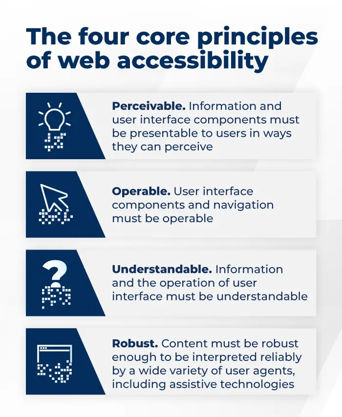
Perceivable - Information and user interface components must be presentable to users in ways they can perceive.
For example, people who can see or hear the content.
Operable - User interface components and navigation must be operable.
For example, people can use the computer by typing or voice.
Understandable - Information and the operation of user interface must be understandable.
For example, people get clear and simple language.
Robust - Content must be strong enough to be interpreted reliably by a wide variety of user agents, including assistive technologies.
For example, people can use different assistive technologies.
In short, if any of these are not true, users with disabilities will not be able to use your website.
Be mindful of situational needs, too
A visitor's needs can differ depending on their environment or needs, affecting how they consume your content. Situational limitations can alter how we consume information on the web, such as:
▪️ Auditory: When in a noisy coffee shop or train, text or visual content is preferred.
▪️ Physical: When holding a baby or cooking/cleaning, information via audio would be best.
This is why it is important to ensure your content is accessible to everyone, as web accessibility also benefits people without disabilities to create an enhanced user experience overall.
One way to do this is by providing multiple ways to consume content on one page (e.g. pictures, videos with captions, audio, text, and tools) so all users can get the most from the page regardless of their situation or ability.
Situations where accessible content helps everyone:
▪️ An auditory learner will want to consume new information with a podcast rather than a piece of long-form text content.
▪️ Someone on an aeroplane who forgot their headphones would appreciate closed captions or a transcript for a video.
▪️ An infographic highlighting key points makes it easier for a marketing professional looking for industry information to integrate insights into their presentation.
Note:A screen reader cannot read the content within an infographic because it is an image. As a result, image infographics require an alternative text description in the form of a transcript. More on this can be found on CSUN’s guide to accessible infographics.
▪️ A consumer reading in a language that is not their first language may benefit from simple content with short paragraphs and no higher than a high school-level readability score.
2. Why is website accessibility important?
In today’s world, the web is used in pretty much every aspect of day-to-day life, at work, at home and on the road. Therefore, it is crucial that the web is accessible for all users to provide equal access and opportunity to everyone, no matter their situation or ability.
In fact, the United Nations Convention on the Rights of Persons with Disabilities (UN CRPD) says that access to information and communication technologies (which includes the web) is a basic human right. Further to this, most countries around the world have ratified this UN convention, and several have adopted binding policies too.
"Access to information and communication technologies is a basic human right."
— United Nations Convention on the Rights of Persons with Disabilities
In addition to this, web accessibility is also a legal obligation in some countries. In the US, the Workforce Rehabilitation Act of 1973 requires that all “electronic and information technology developed, procured, maintained, or used by the federal government be accessible to people with disabilities”. Closer to home, the European Union also protects digital accessibility under the European Charter of Fundamental Rights. The bottom line, web accessibility is an important requirement that we all must meet.
It's good for humans
Be inclusive to visitors with disabilities and provide a better experience for everyone on the web. This also includes socioeconomic backgrounds, education, and physical and cognitive abilities.
In a report by Level Access, the top two reasons businesses addressed accessibility were to “include people with disabilities” and “provide the best user experience for all users”.
It's good for business
The W3C says improving innovation, enhancing brand image, and extending market share are among the top reasons for organisations to optimise their web accessibility.
Level Access’ State of Digital Accessibility report suggests web accessibility practices increases consumer loyalty, enables work to be more valuable in the future, and increases organisational efficiency while decreasing operational costs.
What's more, economically, ignoring the disabled community means ignoring millions of potential customers with billions in purchasing power. This is why designing websites with accessibility in mind is important.
Our Graphic Design Lead, Scott Bowman, explains:
"User experience and simplicity are everything."
"If a user is on your site to achieve something, like purchasing a product, your job as a designer is to make that as seamless as possible. Think of it as a journey - they start on the homepage and want to end at the checkout, you need to make that journey simple stepping stones to clearly navigate. It shouldn't be a jungle to get lost in."
3. How to improve website accessibility
Accessibility can be built into the underlying code of websites and applications, and there are loads of resources available from W3C to help support many accessibility features, especially in HTML. An example of this is alt-text for images which are read aloud by screen readers and also used by search engines. Here are a few ways you can improve accessibility on your website.
Headings
 If you look at any accessible website, you’ll see a lot of headings have been used. This is because it:
▪️ Helps to break text into chunks to make it more digestible for those who struggle with large sections of text.
▪️ Highlights a change in topic, subtopic or point.
▪️ Helps people to scan the text for the information they need (newsflash: not everyone wants to read the whole page).
You must use proper heading formatting or tags. This is where you format the heading as:
1. Heading 1 (H1) for the page title (there should only be one per page).
2. Heading 2 (H2) for headings.
3. Heading 3 (H3) for sub-headings.
4. Heading 4 (H4) after that.
5. Heading 5 (H5) thereafter, and so on.
This helps screen reader users understand the structure of the page, and it also helps search engines to crawl the page too.
Tip: Create headings before writing your content to create a clear, logical structure for your content.
Page speed
Users on mobile devices, older phones with less processing power, or weaker networks can impact how visitors can navigate and access your site’s content.
Pages that are slow to load are less accessible to some demographics/geographics than others based on their networks (location or economic means) or network strength (based on the location of the nearest cell tower).
Webpages can load slowly due to heavy amounts of JavaScript and CSS, large-sized images that aren’t deferred offscreen or have many plugins and widgets that can affect who can access the content efficiently.
Reviewing and correcting any page speed issues could even help to decrease the bounce rate on your site.
Tip: Review the performance of your pages using Google’s Page Speed Insights tool.
HTML sitemaps
An HTML sitemap (often linked in a website’s footer) can provide visitors using a screen reader access to the whole site as an alternative to the main navigation. The HTML sitemap provides an overview of the site and highlights how the content of the site is organised.
The HTML sitemap can provide additional context to search engines, along with an XML sitemap, to understand the structure and relationship of your site and its content.
WAI’s sitemap is an example of an HTML sitemap in practice.
Images
Today, almost 38% of Google’s SERPs contain images - and this is more than likely to increase in the future. Therefore, adding alternative text to photographs is a key principle of web accessibility.
Put simply, the alt-text attribute of the image element is meant to describe the image when visual consumption isn’t an option. This is useful for users of screen readers and search engine crawlers to understand images.
Alt-text best practices:
▪️ Describe the image specifically - imagine the person viewing it cannot see the image.
▪️ Add context if the image doesn’t have a recognisable place or person.
▪️ Avoid phrases such as ‘image of’, ‘picture of’, ‘thumbnail of’ as screen readers already say ’image’ and search engine crawlers understand it is an image because of the image element.
▪️ Be specific and succinct - 125 characters or less.
▪️ Use empty alt attribute for decorative images (purely visual purpose and adds no value to the page's content).
When possible, decorative images should be provided via CSS.
For example: <img src=”https://www.site.com/images/654.png” alt=””>
Anchor text
Link anchor text should be descriptive and make sense to readers outside of the context of surrounding content. Visitors using screen readers can navigate a page from link to link, which is why it’s essential to explain where the link will take them. Search engines can use anchor text to signal what the destination will be.
When trying to figure out what anchor text to use, ask yourself: What content will the reader go to if they click the link?
Be descriptive and avoid generic phrases, such as "learn more", "read more", "click here", ‘more info", and "download this". This provides very little context about the destination page and isn’t helpful for disabled users. Also, avoid using a URL as link text, as they’re difficult to read, and a screen reader will read it all out!
A common approach to internal linking strategy is to use variations of a page’s topic as anchor text on the pages that link to it. This provides helpful context for both search engines and users.
Table of contents
Adding a table of contents (or a what to expect) to your long-form content is an effective way to increase the usability of the page for scanning for busy readers and provides a more approachable way for mobile visitors to access the specific information they came looking for. Using jump links in the table of contents allows users to navigate directly to the section they want to read.
Similarly, a table of contents improves accessibility by providing an overview of the content to come and empowers visitors to go straight to the section of interest.
Language
In the UK, 5 million people have a learning difficulty, 1 in 10 have dyslexia, and 2 million people have a visual impairment. That’s why really important to make sure your language is clear, direct and easy to understand.
The average sentence length is 14 words, and of this, readers understand more than 90%. However, at 43 words, understanding drops to 10%.
There are some other things that can help you improve your language and content:
▪️ Avoid metaphors and figurative language
▪️ Keep paragraphs short
▪️ Use shorter sentences
▪️ Ambiguity
▪️ Acronyms
▪️ Abbreviations
▪️ Industry jargon
Consider the readability level of your content
The readability of your content allows for a wide audience to understand what you’re attempting to convey. Your web pages are more helpful to visitors when written at a level that is friendly to people of varied abilities.
How approachable your content is can depend on its readability score, descriptiveness, and whether it contains short and concise paragraphs.
W3C recommends lower secondary education as the target readability level for most content to be accessible.
Tip: To assess the readability of your content, try a tool like Hemingway Editor.
Text size
Your text needs to be large enough so all users can access it easily. Use 12pt as standard text and do not use smaller, and 14pt and over to be more accessible to a wider audience.
Also, make sure your online documents and web pages have flexibility. This will ensure your readers, customers, or clients can adjust the text size to meet their needs.
It’s also important to make sure the font you use is accessible. The accessibility of fonts can vary with different needs, particularly dyslexia. Again, flexibility is essential as it means people can change the font to one accessible to them.
Colour
Not having enough colour contrast is a common accessibility issue. In fact, recent research found that 83.9% of homepages had low contrast text - the most common web accessibility failure of all in 2022.
Poor contrast can make it difficult for some people to tell two colours apart to see or understand the content. This is particularly difficult if you have low vision or colour blindness.
To meet the WCAG AA standard, you need to have a contrast ratio of:
▪️ 4.5:1 for normal text
▪️ 3:1 for large text and graphical objects
Always check you have enough contrast when:
▪️ Creating content for websites (or anywhere for that matter)
▪️ Putting text on an image, graphic, button or coloured background
▪️ Changing the colour of your text against a white page, like changing text to red in an email
If you’ve used colour to highlight a link, you should also add an underline for anyone who cannot see the colour to signify it’s a link.
Tip: To check the contrast on your website, use the WebAIM contrast checker. The Coblis colour blindness simulator is useful to see what your website looks like to a person who is colour blind.
It’s worth noting that some users will change the colours on a website or change the background, like using dark mode or high contrast modes, to make them easier to read. Unfortunately, it's impossible to know from Google Analytics if someone is using a specific setting or tool to adjust how a website is displayed, so it’s important to make sure your content is still visible and usable when altered this way from the get-go.
4. A basic web accessibility checklist 
Checking accessibility in detail requires a large amount of technical expertise and is best left to either an accessibility expert, or a third-party accessibility auditor.
However, that doesn't mean you shouldn't still regularly carry out basic accessibility checks yourself from time to time.
Bookmark this six-step checklist to refer back to whenever you need it.
1. Check text content
▪️ Check you're using proper headings
▪️ Check any instructions are styled properly
▪️ Check that links make sense
▪️ Check your pages have good titles
2. Images, video and audio content
▪️ Check any images have a description
▪️ Check any video or audio content is properly described
▪️ Check you have audio descriptions for video and audio content
▪️ Check for images containing text (e.g. infographics)
3. Interactive tools and transactions
▪️ Check form fields are marked up appropriately
▪️ Check it's clear what information users need to provide
▪️ Check form elements are consistent across your website
▪️ Check users get a warning before they're timed out
▪️ Check that any error messages are genuinely helpful
▪️ Check users can review their answers before submitting a form
▪️ Check that form elements behave as expected
4. PDFs and other documents
▪️ Check any documents have descriptive titles
▪️ Check for headings
▪️ Check the documents convey instructions in an accessible manner
▪️ Check that any link text makes sense
▪️ Check that images, charts and tables have a description to accompany them
5. Technology
▪️ Check your website is usable on mobile and tablets
▪️ Check that users can navigate your website using just a keyboard
▪️ Check that content is usable when zoomed in or magnified
▪️ Check your colour contrast meets the WCAG 2 guidelines.
▪️ Check that users can disable pop-ups or flashing images
▪️ Check whether there’s an alternative for people who cannot see maps
▪️ Check there are multiple ways to navigate your website
▪️ Check your navigation behaves consistently (i.e. breadcrumb trails)
6. HTML checks
▪️ Check tables and bullet lists are styled properly
▪️ Check the language the content is written in
▪️ Check any video players are accessible
Once you’ve finished these checks, you must start making a plan to fix any accessibility problems you found. Please be aware that this is not an exhaustive list. If you would like more in-depth information, visit the Web Accessibility Initiative.
Please note: This is not a comprehensive list of web accessibility requirements. This post is just an overview for those starting out and wanting to learn more about web accessibility. If you need a comprehensive accessibility audit, speak to our SEO and GEO agency team today.