
POST
Using Different Types of Visualisations to Represent Data
Imagine, working on your latest asset as part of your content strategy and coming across that perfect article. You open it only to be faced with a page of text and data.
To some people, this would be their idea of heaven. Word after word, sentence after sentence, paragraph after paragraph of text to read, digest and understand. Littered with facts, data and seemingly more words than a Dickens novel. To others, this would be their ideal of hell and immediately off-putting. ‘Where are the visual elements of this page?’ I hear you cry. ‘I don’t have the time or inclination to read all of this information!’
The reality is, we all absorb information in different ways.
The average adult today now consumes over 34 gigabytes of information per day, which equates to about 100,000 words. The human brain processes visual content about 60,000 times faster than written stimuli; it takes only a millisecond to process an image but up to a minute for the average person to read 300 words.
For the purpose of this article, I will be referring to data visualisations that will incorporate a range of data presentation methods, including graphs, maps, charts and diagrams.
What's in this article?
1. The importance of data visualisations
2. The dos and don'ts of data visualisations
3. The different types of data
1. Why is it important to use visualisations to represent data?
When faced with a table of data, it can appear to some as quite overwhelming and, let’s face it, quite dull.
Now, there will be those of you who will disagree and are excited by a table of numerical data to number crunch and analyse. However, when it comes to reality, you are probably in the minority as 91% of people say they prefer visual content over written content, which makes the use of imagery and data visualisations even more pertinent.
There are many benefits to using data visualisations:
◾ They are a common method of visually representing relationships in the data
◾ They present data that are too numerous or complicated to be described purely by text alone
◾ They use up less space on the page
◾ They condense large amounts of information into an easy-to-understand format
◾ They clearly and effectively communicate the most important points
◾ They show clear patterns, trends and anomalies within a dataset
Ultimately, the main function of data visualisations is to display the data in a more accessible way and invite further exploration of the topic. This may take the form of suggesting possible reasons for the trends or instigate further research into the topic.
They are used in situations where a simple table will not adequately demonstrate the importance of the relationship or pattern and would be an essential part of any strategy for a digital PR agency, or team.
Our Graphic Designer, Daniel Culyer, agrees:
“Presenting data in a visually attractive way will help catch the eye of the reader... providing a subconscious filtering mechanism for the reader whilst also making the information look and feel less boring!”
2. What are the dos and don’ts when using visualisations?
|
Dos |
Don’ts |
|---|---|
|
Use a graph if there is a definite trend or relationship between two variables |
Use data for small amounts of data that could be conveyed in a sentence |
|
Ensure that the correct graph is used to represent the correct type of data |
Reiterate all of the data in the text as it defeats the purpose of having the graph |
|
Consider the use of colour on your graph and how this can be used to effectively display the data |
Use a graph if the trend is not shown to be significant |
|
If an extremely large data range must be covered and cannot be shown with a continuous line, then indicate a discontinuity in the scale and the data field with paired diagonal lines (—//—) |
Manipulate the axes and scale to misrepresent the data |
|
Use lines to connect discrete data points |
Data visualisation checklist: What to check before you click 'publish'
✔ Clear and readable
✔ Appropriate font size and symbols
✔ Clear and descriptive legend
✔ Figure number
✔ Caption to explain what the graph is showing
✔ Clear data field showing values and units
✔ Labelled axes
✔ Appropriate scales
✔ Credit the original source of the data
✔ Vertical axis represents the dependent variable (i.e. the thing that is changing)
✔ Horizontal axis represents the independent variable (i.e. the constant)
3. What are the different types of data?
Before deciding which data visualisation to select, it's important to ensure that you choose the correct data visualisation technique for the correct type of data that you are wanting to represent. One of the biggest data visualisation mistakes out there is choosing a graphic that doesn't suit the data it's trying to show.
Here is a rough outline of the different types of data, what they mean, and some examples:
|
Type |
Definition |
Example |
|---|---|---|
|
Nominal |
Can be divided into distinct groups that do not overlap |
Country, race and hair colour |
|
Ordinal |
A type of categorical data with a set scale or order |
Income levels, education levels and satisfaction levels |
|
Continuous |
Data that can fall anywhere within a range |
Temperature, time and weight |
|
Discrete |
Data that is countable but can only fall in certain groups |
Shoe size, number of students in a class and results of rolling two dice |
|
Ratio |
Where an equal and definitive ratio exists between each data and absolute zero is treated as a point of origin (hence there can be no negative values in ratio data) |
Height, speed and weight |
|
Quantitative |
Data that is expressed by a numerical value (amount or range of data) |
Length, cost and number of days |
|
Qualitative |
Data that is descriptive in nature and non-numeric |
Diary entries, interviews and transcriptions |
4. What are the different types of data visualisations?
Broadly speaking, there are two types of data visualisations that can be utilised to represent data:
 Graphical representations: Any graph or chart used to represent data.
 Cartographic representations: Any form of map used to represent spatial data.
A breakdown of graphical and cartographic representations
Click to learn about each type of data visualisation and its pros and cons:
|
Graphical representations |
Cartographic representations |
|---|---|
Examples of data visualisations
1. Bar graphs

A bar chart is made up of either vertical or horizontal columns all of the same width. The height of the bar is proportional to the quantity represented. They are used to compare a single variable value between several groups.
The vertical scale should be used for % or absolute data. The horizontal scale axis should be used for discrete or categorical data. All bar charts should begin at zero on the vertical axis.
|
Advantages |
Disadvantages |
|---|---|
|
Commonly used so easier to understand |
Not good for large data sets as can get confusing with lots of bars |
|
Shows relative magnitudes easily |
Can give false impressions about the data |
|
Can be manipulated to show positive and negative values on one graph (e.g. temperature) |
Only describes the data (does not explain) |
|
Easy to compare data (such as peaks and troughs) |
Difficult to interpret small changes in data if you have a large range in your data |
|
Easy to identify trends and anomalies |
|
|
Useful for displaying continuous data |
2. Line Graphs
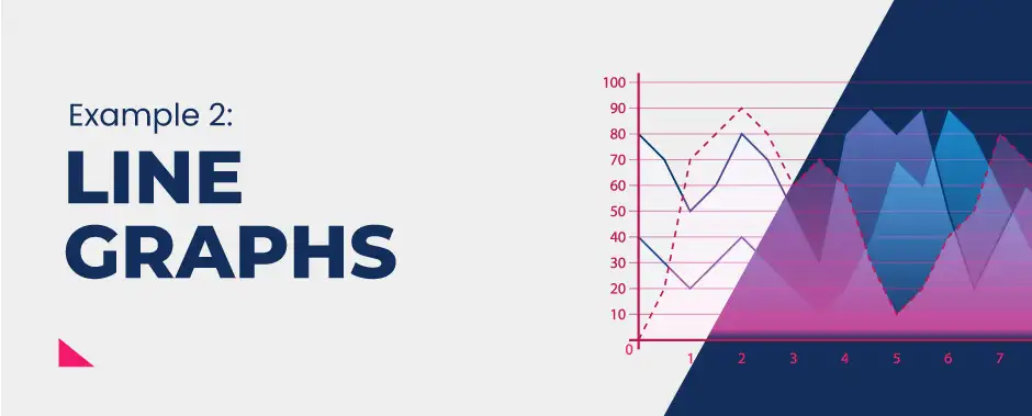
A line graph shows how one variable changes against another over time. The variables must have something to do with each other. The horizontal axis represents the independent variable (e.g. time) and must have equal spacing, whereas the vertical axis represents the dependent variable (e.g. number of houses sold).
|
Advantages |
Disadvantages |
|---|---|
|
Shows clear changes over time |
Scale needs to be carefully considered to avoid skewing the pattern |
|
Can show a large amount of data in one graph |
Works better with smaller data sets |
|
Can be easily understood and requires little explanation |
Can get confusing if lots of additional lines are added |
|
Can show clear patterns and anomalies which help with interpretation |
If you have a large range then this can skew the axes and the shape of the graph |
|
Can plot multiple datasets on one graph including negative values |
Sometimes hard to plot exact figures on the scale |
3. Pie Charts

A pie chart is a circle divided into segments; each segment shows the proportion of the total amount. Percentage figures are written inside or alongside the segments to help interpret the diagram. The area of the circle is divided into segments according to the share of the total value represented by that segment.
Each slice should show significant variations; the number of categories should be generally limited to between three and 10.
|
Advantages |
Disadvantages |
|---|---|
|
Good way of showing how the total is divided up |
If numbers are small, it can be difficult to accurately assess % data |
|
Visually effective and easy to see the relative proportions in the data |
Comparing pie charts is difficult unless they are drawn in proportion to their data size |
|
Can be plotted on a map to also show spatial data |
Small segments less than 5 degrees are difficult to draw accurately |
|
Can be easy to compare groups in terms of their relative size |
If you have lots of groups, this can make it difficult to draw accurately |
4. Scatter Graphs
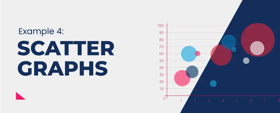
A scatter graph shows the relationship between two variables by the distribution of dots. It is usual that the dependent variable is placed on the y-axis (vertical), and the independent variable on the x-axis (horizontal). Dots are plotted on the graph using the two sets of data as coordinates. The arrangement of dots can then be examined to see the relationship.
A best fit line is drawn that comes close to as many points on the graph as possible.
|
Advantages |
Disadvantages |
|---|---|
|
Shows trends and patterns in a set of data |
Difficult to visualise outcomes in large data sets |
|
Retains the exact values and sample size |
Flatline of best fit is inconclusive |
|
Shows maximum and minimum values and outliers |
Data on both axes should be continuous |
|
Can be twinned with Spearman’s rank to test the strength of the relationship |
Subjective interpretation and positioning line of best fit |
|
Can be used to interpolate and extrapolate the data |
Works better with large data sets |
5. Histograms

A histogram, also called a frequency distribution graph, uses bars with no gaps between them. It represents continuous data, for example over time. Individual data points are grouped together in classes to show the frequency of data in each class.
The values may all be part of a single sample and, if the bars are effectively connected, a single colour or type of shading is used. There should be equal class intervals between the bars.
|
Advantages |
Disadvantages |
|---|---|
|
Easier to analyse changes over time as the bars are together |
Difficult to interpret specific data as the data is grouped |
|
Works well with a large dataset or range |
Can only display one set of data so difficult to compare between data sets |
|
More consistent as the intervals are always the same |
Can only be used with continuous data |
|
Useful when trying to analyse the frequency of something |
|
|
Can be compared to a ‘normal’ to see how similar it is |
|
|
Can be used to check if a variable follows a normal distribution |
6. Proportional Divided Circles
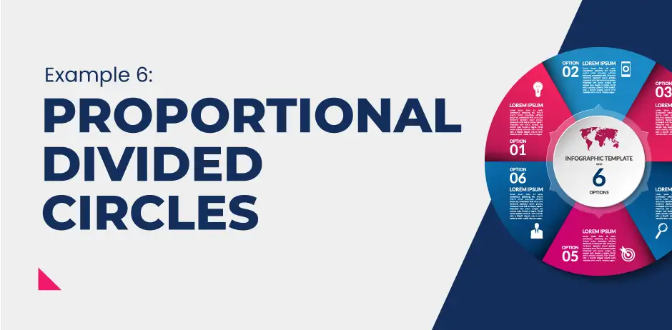
A proportional divided circle is used to show a particular quantity (such as the population of a country) that can be divided into sections (such as different age groups).
A circle is drawn to represent the total quantity. It is then divided into segments, much like a pie chart, proportional in size to the components.
The actual size of the circle can also be used to represent data and reflect the overall population/sample size for that particular area.
|
Advantages |
Disadvantages |
|---|---|
|
Displays the relative proportions of multiple groups of data |
Cannot easily retain exact values |
|
The size of the circle can be made proportional to reflect the total quantity it represents |
Not really applicable with data over time unless you use lots of pie charts which can become cluttered |
|
Can summarise a large amount of categorical data |
Can become confusing with lots of different groups |
|
Easier to draw comparisons between different areas/groups |
Overlapping of pie charts can add to the confusion |
|
Visually easy to understand and interpret |
Very small values are often lost within the visualisation |
7. Triangular Graphs
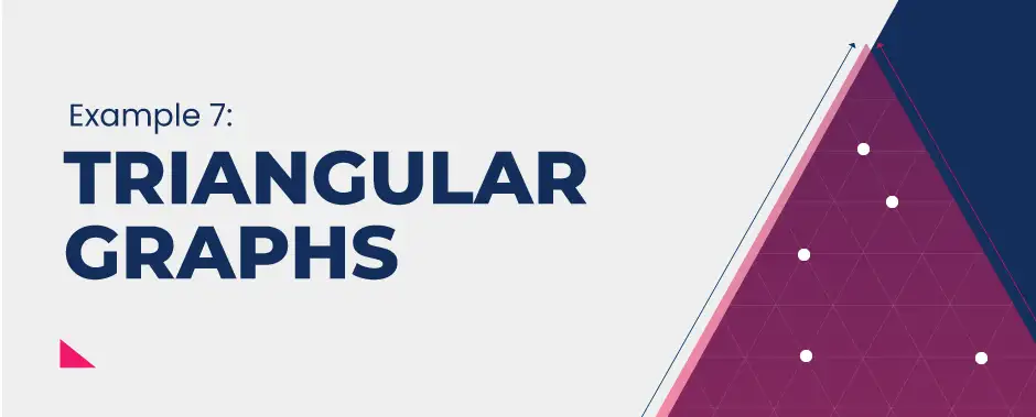
Triangular graphs, also known as ternary graphs, are used to display data based on three variables simultaneously.
They can only be used for three variables where their total each equals 100%.
It is an equilateral triangle consisting of three axes. Points are plotted by reading the correct value from each axis and placing a point on the grid.
|
Advantages |
Disadvantages |
|---|---|
|
Spatial method for representing the relative abundance and position of data in relation to the whole data set |
Can only be used for percentage data |
|
Easily draw comparisons between the data |
Can become difficult to interpret if data is overlapping |
|
Can identify clusters and common patterns |
A limited range of data can be used |
|
Can easily identify anomalies within the data |
Cannot plot raw data (it has to be converted into a percentage first) |
|
Colour can be used to indicate subdivisions within the data set |
Time-consuming to construct and mistakes are likely due to human error |
8. Logarithmic Scale
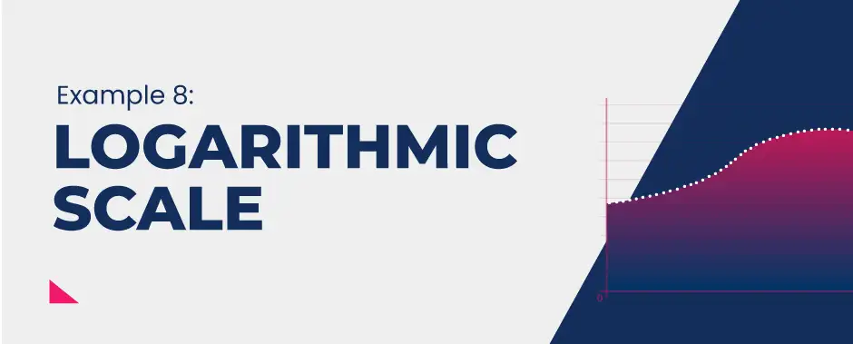
A logarithmic scale is a scale of measurement where the position is marked using a logarithm of a value instead of the actual value.
It is a nonlinear scale and is often used when displaying and analysing a large range of quantities within a data set.
Instead of increasing in equal increments (i.e. 1, 2, 3, 4, 5), each interval is increased by a factor of the base of the logarithm (i.e. 1, 10, 100, 1000, 10000 would be a base ten or a factor of ten).
|
Advantages |
Disadvantages |
|---|---|
|
Useful for plotting rates of change over time |
Can become difficult to analyse when using the scales provided |
|
A wide range of data can be displayed on one graph |
Can be difficult to read small values/data between the increments |
|
Good for comparing data |
Zero cannot be plotted |
|
Increased detail on smaller values as the larger values are depressed to the eye (smaller values, therefore, occupy a larger proportion of the graph) |
Negative values cannot be plotted on the same graph |
|
Better overall trend of all the data as it is all plotted onto one graph |
9. Dispersion Diagram
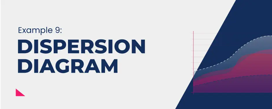
Dispersion graphs are used to display the main pattern in the distribution of a dataset (how spread out the data is).
|
Advantages |
Disadvantages |
|---|---|
|
Visual method so it is easy to spot patterns and anomalies |
Doesn’t work well with small datasets |
|
Can be used alongside statistical methods such as interquartile range, average and standard deviation |
Standard deviation can be easily manipulated and can show bias (if you have anomalies in the data) |
|
Shows how data is spread around the mean average |
Scale needs to be adjusted in order to incorporate the full range of data |
|
Can plot lots of data onto one graph and compare figures easily |
Can be highly impractical if you have a large range in data and therefore difficult to plot precise values |
10. Box Plot

A box plot is a graph that summarises a large amount of data. It is used to display a statistical summary of one or more variables, such as the minimum, lower quartile, median, upper quartile and maximum values.
|
Advantages |
Disadvantages |
|---|---|
|
Can help to ascertain the degree of dispersion within the data set |
Does not retain the exact values and details of the distribution |
|
Can help to judge whether the data is symmetrical or skewed |
Hides the multimodality of the data set |
|
Can help to identify outliers in the data |
Can generate clustering which obscures data analysis |
|
Handles large data sets easily |
Mean average is difficult to calculate |
|
Can be easily compared with other data sets |
Outliers may be industry-based or on a case by case basis |
|
Can be combined with other data visualisations like histograms and dispersion diagrams for more detailed analysis |
11. Pictogram

A pictogram uses pictorial symbols or icons instead of a bar. All icons must be the same size, but fractions of icons can be used to represent values in between (e.g. half).
|
Advantages |
Disadvantages |
|---|---|
|
Clear and effective representation of data |
Can be difficult to draw by hand as icons must be the same size |
|
Visual technique so easy to interpret |
Can be difficult to extract precise data from the graph |
|
Can see clear patterns, trends and anomalies |
Difficult when dealing with very specific fractions |
|
Can be used to show multiple characteristics at once |
Can only be used with data that can be easily symbolised |
|
Visually standardised so easily recognisable and comparable |
Only works well with a small number of groups (2-6) |
12. Atlas Maps
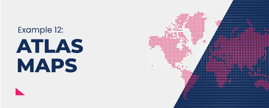
Lines of latitude and longitude are used to locate places accurately on the Earth's surface.
Lines of longitude
These imaginary lines run parallel to the equator, from east to west. They divide the world into the northern and southern hemispheres. They are parallel but they are not the same length and get shrink as they move away from the equator, reaching 90° at the poles.
Lines of longitude
Lines of longitude run from the top of the Earth to the bottom – north to south. They are not parallel as lines of latitude are – they meet at a point at the north and south poles and are called meridians. The lines start at the Prime or Greenwich Meridian (0°) and move east and west to the International Date Line (180°).
Using atlas maps
Atlas maps show a range of information, such as:
◾ Countries and regions
◾ Settlements and political borders
◾ Physical features, such as relief.
◾ Thematic maps, such as climate and biomes.
◾ Global issues, such as global warming and sea-level rise
13. Weather Maps
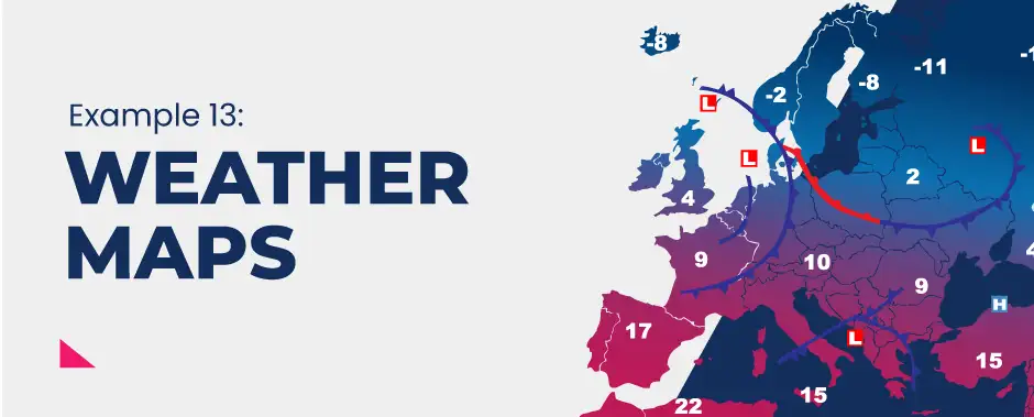
Weather refers to atmospheric conditions in a particular place at a particular time of day. Therefore weather is likely to change on an hourly, or even minute by minute, basis, depending where you are in the world.
This information can be represented in the form of a weather map (also called a weather chart or a synoptic chart).
These cartographic representations often use symbols to represent what the weather is like.
This may include:
◾ Isobars to represent air pressure
◾ Isotherms to show temperature gradients
◾ Wind speed and direction
◾ Cloud cover, precipitation type and levels
◾ Sea conditions
|
Advantages |
Disadvantages |
|---|---|
|
Data can be useful to analyse changes over time and space by studying multiple maps |
Data can be unreliable or inaccurate and is rarely in real time |
|
Can be used as a predictive tool for weather forecasts and informing people in tourism, aviation, trade and agriculture |
Data can change over a relatively short period of time so many become unusable once it is produced |
|
Can analyse patterns and identify anomalies |
An understanding of the symbols is required in order to accurately interpret the information |
|
Can be used to judge wider weather phenomena such as the formation of storms, movement of cold and warm fronts |
Often use interpolation of data which is highly subjective and open to questions of reliability |
14. O.S Maps

Maps are produced at different scales. The scale of the map is how much smaller the map is compared to the area it represents.
Landranger Maps
1:50 000 scale means 2cm on the map means 1km on the ground.
It covers a larger area but shows less detail.
Explorer Maps
1:25 000 scale means 4cm on the map means 1km on the ground.
It covers a smaller area but shows more detail (e.g. footpaths).
Grid References
Ordnance Survey maps are covered in a series of blue gridlines. These grid lines can be used to pinpoint locations through a unique number known as a grid reference.
A four-figure grid reference is a handy way of identifying any square on a map. Four figure references are useful if you’re trying to describe the position of a large feature such as a forest or settlement.
Grid references are easy, as long as you remember that you always go along the X-axis first before you go up the Y-axis - you may remember the saying from school: “along the corridor and up the stairs”.
A four-figure reference on an Ordnance Survey map equals an area on the ground of one square kilometre. One kilometre is quite a large area. To be more accurate we need to use a six-figure grid reference. This pinpoints a place exactly to within 100 metres.
15. Sketch Maps

A sketch map is drawn to produce a simplified version of an OS map. It should focus on just a few key features, such as patterns of roads or rivers without lots of other information.
All sketch maps should have:
◾ A frame around it using the same scale as the map.
◾ Grid squares with grid numbers around the frame.
◾ Features drawn in pencil.
◾ Labels and annotations to highlight the key features
◾ A scale bar, north arrow and title.
16. Located Proportional Symbols

Proportional symbols are used to show data on a base map where spatial variations can be seen. The symbols are proportional to the size of the data set being plotted and analysed.
|
Advantages |
Disadvantages |
|---|---|
|
Useful for comparing changes between different places |
Difficult to calculate the precise value as the scale is often in groups |
|
Visually easy to spot patterns and anomalies |
Very time consuming to construct |
|
Easy to read as each symbol is proportional |
Size of the symbol may obstruct locations or cause symbols to overlap |
|
Values can be calculated/estimated using the key |
Only shows data on one level (i.e. country/regional level) so does not show smaller variations |
17. Flow Lines

This technique indicates the direction and volume of movement, with the thickness of the line representing the volume.
They show the movement between places by connecting the source with the destination and the route taken.
|
Advantages |
Disadvantages |
|---|---|
|
Immediate visual impression of the data and general patterns/anomalies |
Specific values are lost as data is grouped within a range |
|
Good for showing the actual journey taken between two places |
Difficult to draw accurately if working on a large scale |
|
Clear sense of direction and spatial patterns in the data |
Lines can overlap which make it confusing |
|
Proportional arrows give a strong indication of magnitude of movement |
Relies on huge data sets (i.e. lots of people travelling at the same time) so limited in its usage |
18. Desire Lines
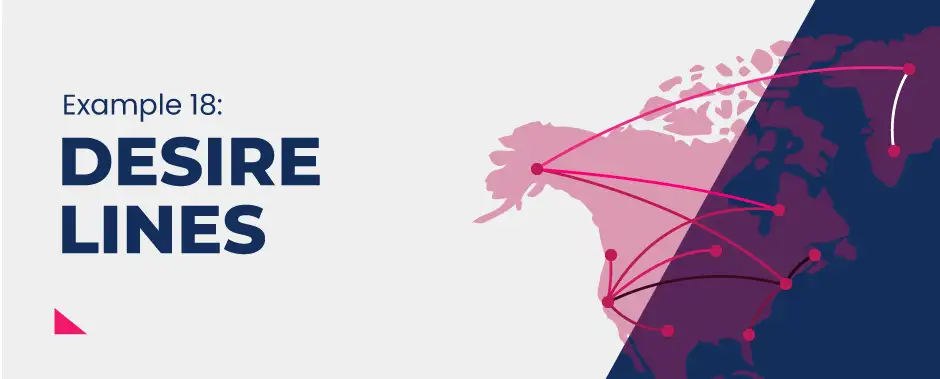
A desire line map shows the movement of people or goods between places.
They may also be proportional and show distances between places and show the spatial density of the data represented.
|
Advantages |
Disadvantages |
|---|---|
|
Immediate visual impression of the data and general patterns/anomalies |
They do not reflect the precise path taken (only source and destination) |
|
Good for showing movement between two places |
Difficult to draw accurately if working on a large scale |
|
Clear sense of direction and spatial patterns in the data |
Lines can overlap which make it confusing |
|
Proportional arrows give a strong indication of magnitude of movement |
Values are not always retained, especially if they are not proportional |
19. Trip Lines
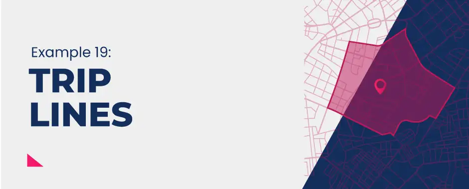
Trip line maps are probably the simplest way of showing movement, from a starting point to a central point (A to B).
This may be used in mapping a school catchment area or looking at the sphere of influence for a shopping centre.
|
Advantages |
Disadvantages |
|---|---|
|
Immediate, visual impression of the data |
Often difficult to determine precise data as lines tend to overlap |
|
Gives a clear sense of direction |
Difficult to construct when dealing with large datasets |
|
Can pinpoint specific locations and areas |
Map can become overwhelming and difficult to show the meeting points of the lines |
|
Can be easily superimposed onto a base map of any scale |
20. Choropleth Maps

A choropleth map uses different colours or different densities of the same colour/shade to show the distribution of data categories. Some maps also use cross-hatching and different density of patterns.
|
Advantages |
Disadvantages |
|---|---|
|
Easy to interpret using the key |
It only shows a whole region so may hide local variations |
|
Data is normally presented by country/region so easy to see patterns over a larger area |
It assumes there is a defined change in the boundary which is not always the case |
|
Data is grouped so easy to see the spread of data |
Intervals need to be selected carefully and can sometimes be broad so hide the specific values |
|
Good for showing patterns and changes over space and identifying anomalies |
Can’t read the exact values on the map (only show general patterns) |
21. Dot Maps

Dots are used to represent a particular value of a number and are located accurately on a map. The number and density of dots represent the data and how it is distributed.
|
Advantages |
Disadvantages |
|---|---|
|
Good general patterns of spatial distribution and anomalies |
Assumes that no dots equal to a value of zero |
|
Useful for analysing clusters of data |
Precise values are lost as normally each dot in itself is a high value |
|
Dots are located based on specific geographical location so very precise |
When dots overlap, it is hard to see patterns on a small scale |
|
Can be twinned with a choropleth map to show different sets of data on one map |
Subjective nature of dot size and spacing can be misleading |
22. Isoline Maps

An isoline uses lines of equal value to show patterns (‘iso’ means ‘equal’). The most common examples in geography are contour lines (which show values of equal height) and weather maps (which show values of equal air pressure or temperature).
|
Advantages |
Disadvantages |
|---|---|
|
Show gradual changes and patterns over a large area |
Can be variations at a local level that are not shown |
|
Easy to see areas of equal value |
More difficult to construct as you need precise coordinates of locations |
|
Uses fixed intervals so easy to identify changes |
Need a large data set to produce something of value |
|
Colour can be added to show density and make changes more obvious |
Shading implies equal value between the isolines which may not be the case |
|
Can be superimposed onto a base map easily |
Can only show one data set at a time |
23. Kite Diagrams

A kite diagram is a graph that shows the number of a particular group (i.e. people, animals, plants, types of vehicle) against distance along a transect.
The X-axis consists of the distance covered and the Y-axis denotes each of the groups that data was collected for.
They are used to plot several observations seen along with various points of the transect.
|
Advantages |
Disadvantages |
|---|---|
|
Allows for comparisons between the different frequencies of different observed data |
Makes assumptions that the amount of data recorded on one side of the transect is identical on the other side of the transect |
|
Can see distinct patterns of change over distance |
Difficult to represent a large range of values, particularly very small values (like 1) when you have others that might be 10 or higher) |
|
Potential and hypothesised relationships can be determined between different observations |
Visually subjective as the scale influences the visual effect |
|
Large range of values can be converted into percentages to make the plotting of data easier |
Not all data can be represented in this type of graph |
|
Visually clear and easy to interpret one category from another |
Relies on more than one category of data being collected |
24. Radial Diagrams
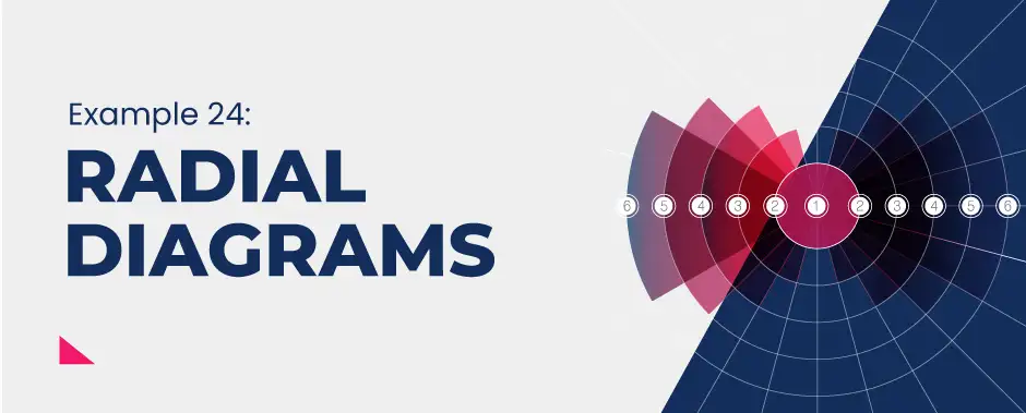
A radial diagram is used to illustrate the relationship between items where each item is linked to a centre item.
This is an organisational chart that starts from the centre rather than the top/side.
They are, essentially, bar charts displayed on a polar coordinated system to show how variables change due to an independent variable.
|
Advantages |
Disadvantages |
|---|---|
|
Visually impacting and easy to see patterns |
Difficult to spot anomalies |
|
Useful for representing spatial data or directional data |
Limited use - can only be used with certain types of data |
|
Can compare multiple data sets or changes over time |
Can become very crowded with lots of data sets |
|
Values are retained |
Overlapping of bars makes it difficult to see individual data |
|
Can compare individual variables within a data set |
Judging the scale can be difficult depending on the data set |
Concluding points
In a world where we are now inundated with data, and the growth of which is exponentially expanding, it is arguably becoming more important than ever to utilise ways of representing that information in order to make it accessible, understandable and meaningful.
Data visualisations have this ability; to display multiple, and often large datasets, in a visually appealing way. And all for the benefit of the audience, allowing them to conveniently follow the data as it tells a story of the world in which they are living, simplifies the interpretation process and allows them to draw conclusions.
Since most of the data collected by scientists and investigators is quantitative, data charts and graphs are usually used in order to organise this information in a way that nine-tenths of the population prefer. However, if used incorrectly, these data visualisations can blur and distort the world around us and provide a misleading picture of reality. The subjective nature of interpretative data analysis means that data can and has been used to misrepresent information.
Five common ways in which data can be misinterpreted on data visualisations:
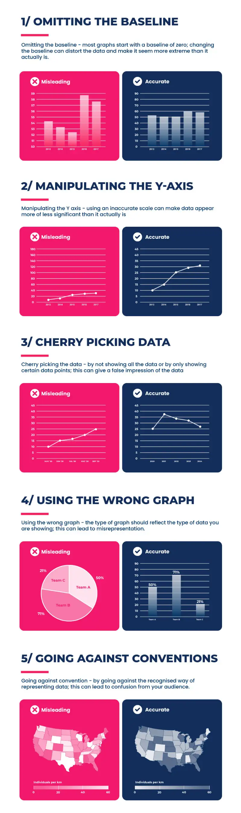
So whatever type of data visualisation you choose, ensure it is accurate, appropriate and not altered to skew the narrative.
That said, there are pros and cons to nearly everything in life and the use of data visualisations are no different. By appreciating their strengths and limitations, this will help you make informed decisions about which is the most appropriate for the data you wish to represent.
And, as we know, a picture often has the power to speak a thousand words.