
POST
What is the Importance of Colour in Brand Recognition?
What colour do you associate with Coca-Cola? Chances are that the exact red hue plastered across cans, billboards and magazine ads for Coco-Cola will come to mind.
Whether it is an innate connection with a colour, like red meaning danger, or a societal influence, like pink being associated with femininity, colour has the unique ability to conjure up a feeling immediately. It is for this reason that when it comes to your branding, colour can have a huge impact on not only what a consumer associates with your business, but how easily you will be remembered too.
For example, Swedish home furnishing company Ikea’s surprising contrast of blue and yellow makes the brand extremely memorable.
Interested in how a colour palette can affect marketing one’s brand, our SEO company team conducted a survey of over 2,500 participating consumers. The results revealed some interesting insights into the psychology of colour in marketing, for example 67% of those questioned were able to recognise the Swedish furniture retailer from a depiction of the iconic colours alone.
So, can you recognise the following companies just from their branding palette? Take our brand colour quiz to find out!
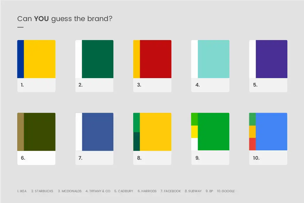
See how your brand-recognition skills match up to other consumers, answers for the graphic are revealed below:
|
ANSWER |
% OF CONSUMERS WHO CORRECTLY IDENTIFIED THE BRAND |
|
67% |
|
80% |
|
84% |
|
17% |
|
31% |
|
22% |
|
|
73% |
|
68% |
|
43% |
|
|
91% |
The importance of colour in marketing
Research has shown that using a signature colour can cause an 80% increase in a consumer’s recognition of your brand. Indeed, even if you can’t see the Starbuck’s logo, chances are you would recognise on of their famous drinks by its characteristic green straw.
We got our graphic designer to create some logos for five made-up companies and showed these to our study participants. After giving them 10 minutes to study the logos, 78% were able to recall the primary colour of the logo, compared to only 43% who were able to remember the name. This showed us that the use of colour in branding is more important in brand recognition than even the name of your business.
Now that you know the importance of colour when marketing your brand, how can you be sure to choose the right one f? It may help to look at what some of the most successful companies have done.
We took a look at the top 100 global brands to see what the most popular branding colours were:
- 34% used black in their logo
- 30% used blue in their logo
- 30% used red in their logo
- 9% used yellow in their logo
- 7% used green in their logo
- 6% used grey/silver in their logo
- 5% used orange in their logo
- 2% used brown in their logo
We also noted that blue was popular for tech companies, whereas red was preferred by the automotive industry and black was by far the most popular choice for luxury brands.
Still trying to figure out which colours to use for your business’ brand? Here are some brand colour meanings:
Yellow exudes positivity
Yellow is the colour of happiness and is known to inspire original thought because it resonates with the left side of our brain- the side used for logic. It can also help you stand out amongst competitors on retailer shelves.
Red gets pulses racing
Whether it produces feelings of passion or danger, the colour red is definitely going to get your heart beating faster. For this reason, it is often used in fast food or retail stores during a sale.
Blue is the colour you can rely on
Both exuding feelings of serenity and dependability, blue has become a favourite colour for brands. Often associated with corporate companies, a shade of blue can bring an air of stability to your brand. Mark Zuckerberg once said that “blue is the richest colour” due to his red-green colour-blindness, and Facebook’s famous blue hue has certainly made him richer!
Pink embodies femininity
Often associated with women, the colour pink in branding can be playful and romantic. It is great for products or services aimed at women, but the use of a hot pink also has an energetic vibe that can work well with a number of industries. The popularity of so-called ‘millennial pink’ in recent years has put pink back in the spotlight with younger generations- perfect for use in branding if this is your demographic.
Green makes you feel healthy
Often found in nature, a logo that uses the colour green will help a consumer associate that brand with organic, from-the-earth ingredients. This makes it a great choice for a food brand wanting to establish themselves as a healthier consumer choice.
Conclusion
As a digital marketing and digital PR agency the findings from this research were incredibly interesting. Knowing how people react to various colour schemes and reinforcing what a key part this can play in overall branding will help keep your designers focused on what the right colour scheme for your business and brand will be.